Andreas Grünewald
Strategic UX Designer & Design Lead
Experience
My Work
About Me
Contact
SCANIA
Report pages - UI Update
About the project
A critical page for thousands of fleet managers to determine client invoices and monitor driver compliance that needed to scale for future data points and improve readability for easier usage.
Role
Lead Designer, UX Designer
Outcome
Base UI refreshed, with new slide in view for details that scales with future data points, fully responsiveness and improved findability on mobile thanks to new mobile-only filter options. Keyboard navigation and responsiveness improved accessibility.
Released in a closed-beta rollout that I pushed through and that impressed Scania management as a new safe way of releasing new products.
The Challenge
Reverse engineering an existing products with limited up-to-date knowledge within the team of its history and implementation required several meetings and workshops.
The Trip Report page (see below) had more data points in its table that fitted a 1440px desktop viewport, and then it had a detailed view with more info.
Design Process
Started with a full feature evaluation of current interfaces and creating a user flow. Continued with workshopping on what to keep, change and discard, followed by a stakeholder alignment, priotitisation workshop and
The Designs
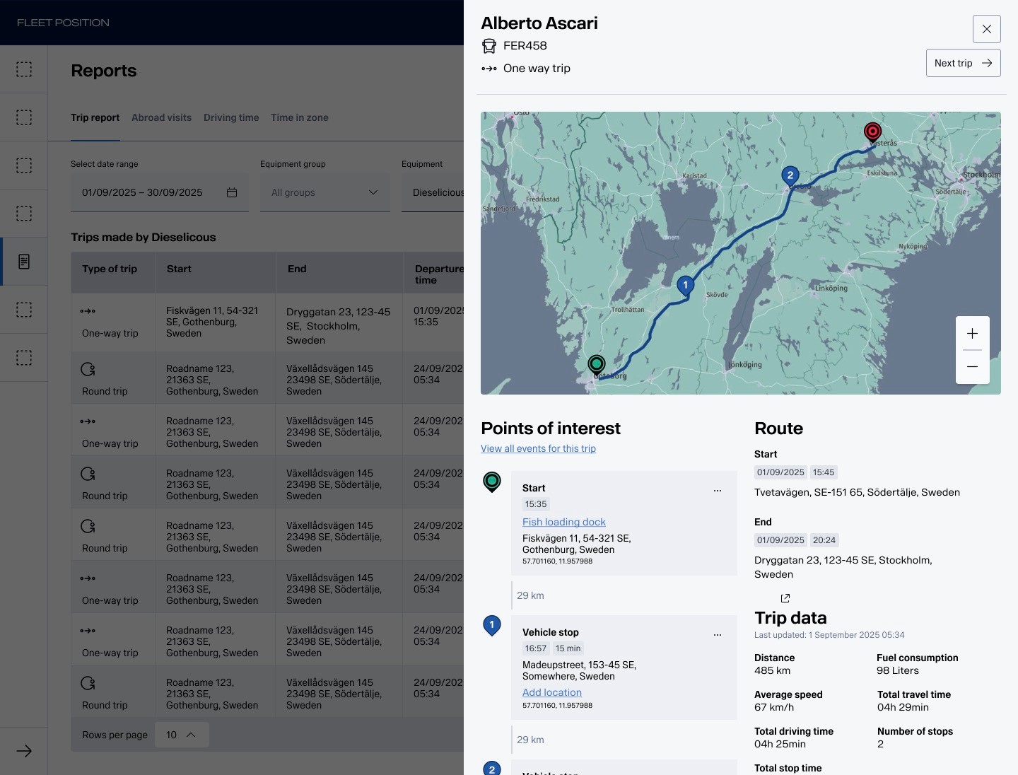
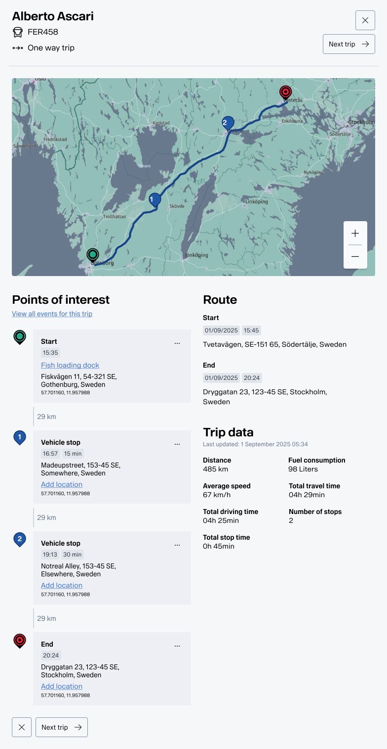
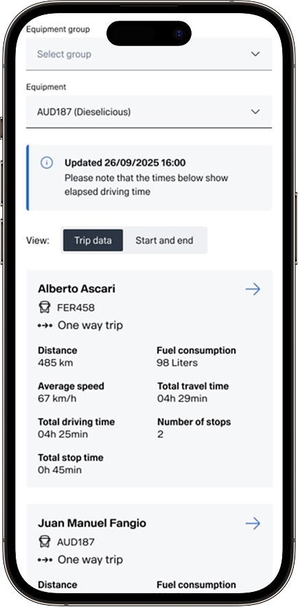
Trip Report - in the background, list of trips. Challenge was the amount of data points in the table made it overflow even a 1440px wide screen. On top - details for a specific trip. Using vertical layouts made it scalable, and gave the user a good overview of the different types of data.
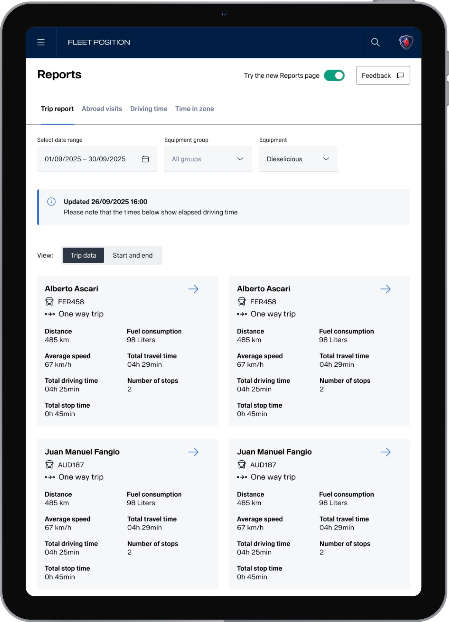
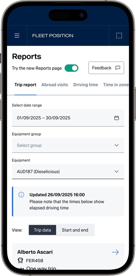
Tablet and mobile view, with the new design toggle visible together with a clear Feedback button. The button triggers a Mopinion form. Toggling off the new reports page triggers a short question (also Mopinion) and sends the user to the old design.
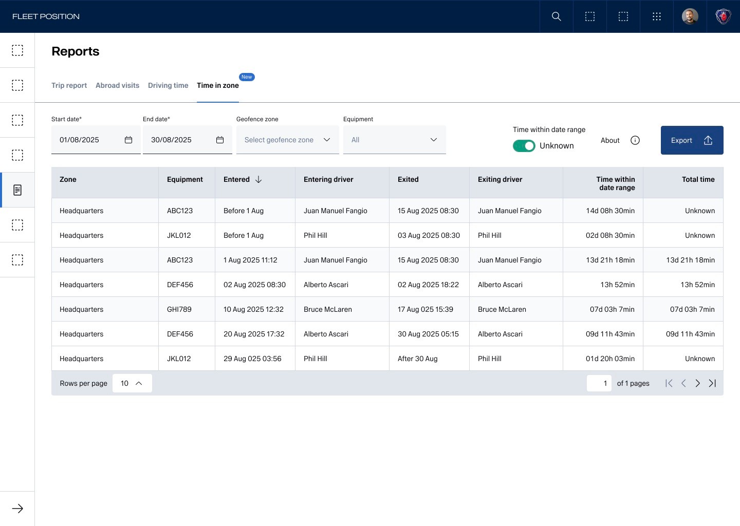
Time spent in zone - a new report added. Badge showing new feature. The toggle “Time within date range” in the upper right corner is to show or hide when we don’t know how long the equipment has been in the zone. This is a mitigation for technical limitations and is explained in the About section. The icon distance to the texts are due to design system limitations, making spacing a bit off. I always use design system to its greatest extent, even with limitations, for easier maintainability and to highlight issues.
Andreas Grünewald
Strategic UX Designer & Design Lead
Experience
My Work
About Me
Contact
SCANIA
Report pages - UI Update
About the project
A critical page for thousands of fleet managers to determine client invoices and monitor driver compliance that needed to scale for future data points and improve readability for easier usage.
Role
Lead Designer, UX Designer
Outcome
Base UI refreshed, with new slide in view for details that scales with future data points, fully responsiveness and improved findability on mobile thanks to new mobile-only filter options. Keyboard navigation and responsiveness improved accessibility.
Released in a closed-beta rollout that I pushed through and that impressed Scania management as a new safe way of releasing new products.
The Challenge
Reverse engineering an existing products with limited up-to-date knowledge within the team of its history and implementation required several meetings and workshops.
The Trip Report page (see below) had more data points in its table that fitted a 1440px desktop viewport, and then it had a detailed view with more info.
Design Process
Started with a full feature evaluation of current interfaces and creating a user flow. Continued with workshopping on what to keep, change and discard, followed by a stakeholder alignment, priotitisation workshop and
The Designs
Trip Report - in the background, list of trips. Challenge was the amount of data points in the table made it overflow even a 1440px wide screen. On top - details for a specific trip. Using vertical layouts made it scalable, and gave the user a good overview of the different types of data.
Tablet and mobile view, with the new design toggle visible together with a clear Feedback button. The button triggers a Mopinion form. Toggling off the new reports page triggers a short question (also Mopinion) and sends the user to the old design.
Time spent in zone - a new report added. Badge showing new feature. The toggle “Time within date range” in the upper right corner is to show or hide when we don’t know how long the equipment has been in the zone. This is a mitigation for technical limitations and is explained in the About section. The icon distance to the texts are due to design system limitations, making spacing a bit off. I always use design system to its greatest extent, even with limitations, for easier maintainability and to highlight issues.
Andreas Grünewald
Strategic UX Designer & Design Lead
SCANIA
Report pages - UI Update
About the project
A critical page for thousands of fleet managers to determine client invoices and monitor driver compliance that needed to scale for future data points and improve readability for easier usage.
Role
Lead Designer, UX Designer
Outcome
Base UI refreshed, with new slide in view for details that scales with future data points, fully responsiveness and improved findability on mobile thanks to new mobile-only filter options. Keyboard navigation and responsiveness improved accessibility.
Released in a closed-beta rollout that I pushed through and that impressed Scania management as a new safe way of releasing new products.
The Challenge
- Users are also very habit-driven and change-critical, implying that minimal interaction design changes are valued.
- Users are hard to reach, making testing difficult within the time-range for the project.
- The Trip Report page (see below) had more data points in its table that fitted a 1440px desktop viewport, and then it had a detailed view with more info, making it challenging to create a responsive layout for it.
- Reverse engineering an existing products with limited up-to-date knowledge within the team of its history and implementation required several meetings and workshops.
- Limited user access for testing
Design Process
Started with a full feature evaluation of current interfaces and creating a user flow of existing solutions.
Continued with workshopping on what to keep, change and discard, followed by a stakeholder alignment and prioritisation workshop.
Then iterations of wireframes and hi-fi’s, limited user testing and developer alignment.
Created a new release gradual rollout and release process with active feedback from users, appreciated by stakeholders and inspired product managers throughout the organisation.
Ended with documentation through user stories and handover documentation to the team.
The Designs
Trip Report - in the background, list of trips. Challenge was the amount of data points in the table made it overflow even a 1440px wide screen. On top - details for a specific trip. Using vertical layouts made it scalable, and gave the user a good overview of the different types of data.
Tablet and mobile view, with the new design toggle visible together with a clear Feedback button. The button triggers a Mopinion form. Toggling off the new reports page triggers a short question (also Mopinion) and sends the user to the old design.
Time spent in zone - a new report added. Badge showing new feature. The toggle “Time within date range” in the upper right corner is to show or hide when we don’t know how long the equipment has been in the zone. This is a mitigation for technical limitations and is explained in the About section. The icon distance to the texts are due to design system limitations, making spacing a bit off. I always use design system to its greatest extent, even with limitations, for easier maintainability and to highlight issues.