Andreas Grünewald
Strategic UX Designer & Design Lead
QLIRO
Checkout - Research Lead, UX Designer
About the project
The Checkout team primarily had a need for in-depth market research to find small and big issues they could improve on the Norwegian and Danish markets. The focus was to understand the local mindset to increase conversation rate for post purchase payments. A secondary need were improving ways of working, update their component library, and assist in development of new functionality.
Role
UX Research Lead, UX Designer
Outcome
- Lead two local researchers in Oslo and Copenhagen in a two day guerilla research effort
- 80 interviews, 67 unique takeaways, >15 user stories for improvements
- Solidifed their offer in the Norwegian and Danish markets.
The Challenge
- Small research budget
- Tight deadline
The Process
A competitor analysis focusing on user experience and functionality led to a strengths and weaknesses definition and comparison. The analysis was made from a professional UX point of view and through team workshops.
This was followed by interviewing Qliro customers and Norwegian and Danish Netlight colleagues to get a broader understanding of their shopping habits and payment preferences.
This laid a foundation for the in-depth research - a guerilla test in Oslo and Copenhagen, where I led two local Netlighters in a 2-day research effort. I planned, guided, executed and summarised the research, where the Netlighters conducted the actual interviews on the streets of their home towns.
We interviews over 80 people in total during these days, focusing on people in their 20’s to their 40’s mostly, since we knew the are the biggest online shopping age group. I also improved design maturity by providing the user perspective in the day-to-day work and future planning, and improved efficiency by updating the component library and mapped out missing error states to improve accessibility.
The Result
This resulted in 67 unique takeaways and >15 concrete user stories for the team, all validated and ready to be solved. Several solutions came into production within the coming weeks after the research, which impressed top management and Qliro's merchants.
The results were used in internal Qliro all-hands and on Qliro events for their merchants and customers.
The Designs
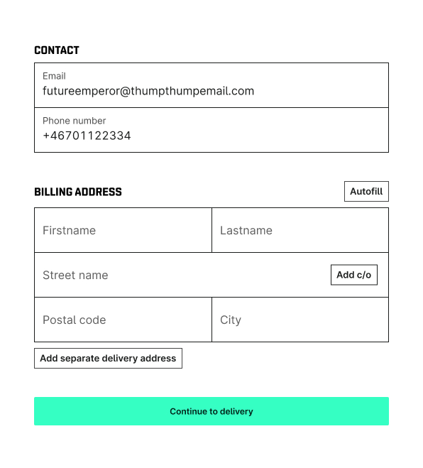
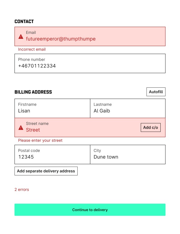
Contact details page – UI update and improving accessibility by having easy-to-spot buttons and error states. Errors are easy to spot, but we also provide info that you have errors close to the main CTA in the bottom, which is preferably if you have limited eye-sight. Added error icons, human friendly error text and made the CTA always enabled to always provide a way forward for the user
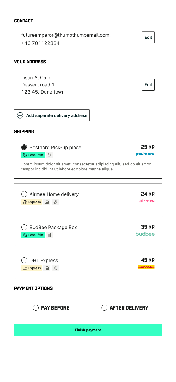
Details summary adn shipping options. Made re-useable and easy-to-implement components of shipping option cards.
Andreas Grünewald
Strategic UX Designer & Design Lead
QLIRO
Checkout - Research Lead, UX Designer
About the project
The Checkout team primarily had a need for in-depth market research to find small and big issues they could improve on the Norwegian and Danish markets. The focus was to understand the local mindset to increase conversation rate for post purchase payments. A secondary need were improving ways of working, update their component library, and assist in development of new functionality.
Role
UX Research Lead, UX Designer
Outcome
- Lead two local researchers in Oslo and Copenhagen in a two day guerilla research effort
- 80 interviews, 67 unique takeaways, >15 user stories for improvements
- Solidifed their offer in the Norwegian and Danish markets.
The Challenge
- Small research budget
- Tight deadline
The Process
A competitor analysis focusing on user experience and functionality led to a strengths and weaknesses definition and comparison. The analysis was made from a professional UX point of view and through team workshops.
This was followed by interviewing Qliro customers and Norwegian and Danish Netlight colleagues to get a broader understanding of their shopping habits and payment preferences.
This laid a foundation for the in-depth research - a guerilla test in Oslo and Copenhagen, where I led two local Netlighters in a 2-day research effort. I planned, guided, executed and summarised the research, where the Netlighters conducted the actual interviews on the streets of their home towns.
We interviews over 80 people in total during these days, focusing on people in their 20’s to their 40’s mostly, since we knew the are the biggest online shopping age group. I also improved design maturity by providing the user perspective in the day-to-day work and future planning, and improved efficiency by updating the component library and mapped out missing error states to improve accessibility.
The Result
This resulted in 67 unique takeaways and >15 concrete user stories for the team, all validated and ready to be solved. Several solutions came into production within the coming weeks after the research, which impressed top management and Qliro's merchants.
The results were used in internal Qliro all-hands and on Qliro events for their merchants and customers.
The Designs
Contact details page – UI update and improving accessibility by having easy-to-spot buttons and error states. Errors are easy to spot, but we also provide info that you have errors close to the main CTA in the bottom, which is preferably if you have limited eye-sight. Added error icons, human friendly error text and made the CTA always enabled to always provide a way forward for the user
Details summary adn shipping options. Made re-useable and easy-to-implement components of shipping option cards.