Andreas Grünewald
Strategic UX Designer & Design Lead
QLIRO
App & Web - Lead Designer
About the project
A core part of the Qliro offer is their logged in web and app experience through which their users can pay their invoices, handle returns, get support, create a savings account or take a loan.
Qliro needed a designer consultant to cover up for a parental leave, and design user validations flows and implement a new translation tool. At my time there I pushed for and got through a redesign of the start page overview for invoices and part payments, a design system update, minor navigation fixes and a redesign of the settings pages.
Role
Lead Designer, UX Designer
Outcome
- Redesigned app and web start page (logged in) for easier navigation, overview and control over invoices and tasks
- Updated part payment experience for easier overview and clearer expectations on actions from the user
- Updates to navigation
- Redesign of the settings pages
- Updated the design system and improved implementation speed from design to production in parallel with other ongoing work
- Validated and selected translation tools, and created key naming conventions to be used within the team
- Created and designed a user validation system through email and phone number
The Challenge
- Time; I had 4 months in the team
- Stakeholder management
- High ownership on design requiring tight collaboration with PO and CPO
- Lack of user contact points
Design Process
A small team owned the whole app & web experience, competing with giants such as Klarna. This meant having a high tempo, tight collaboration, quick decisions and to rely on the senior experiences within the team and stakeholders.
The design process for user facing features was quick, with wireframes to showcase concepts and to get approval, moving quickly to hi-fis and implementations. We relied on conventional UI patterns, familiar design concepts, and followed the laws of UX (www.lawsofux.com) to back up our interaction design decisions. User testing was done with my consultant colleagues and through a practitioner in the team.
This was applied to new start page, where we improved overview and user control over tasks, navigation changes and settings page design update.
The design system was updated in parallel to other features. That meant starting with designs and using new components in the new features. These components were implemented with the new features. This allowed me to be some steps ahead, and for developers to use implementation time for new features to also update the design system.
The validation process was based on common logic seen in many other products that verifies emails and or phone numbers. The design was made so that the same logic can be applied for email and phone, with only minor copy changes differing between them. This meant a simple implementation and a easy-to-understand user flow.
Translation tool selection and implementation was a joint task with PO, CPO, me and our tech lead. We landed on using Phrase, and for that I created a key naming convention that can be used by design and developers alike, so we can create unique keys for each text.
Solution was a drill-down key name, in the format of Page_Topic_Section_Text.Example is; Settings_Account_Email_EmailEntry.
The Designs
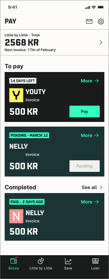
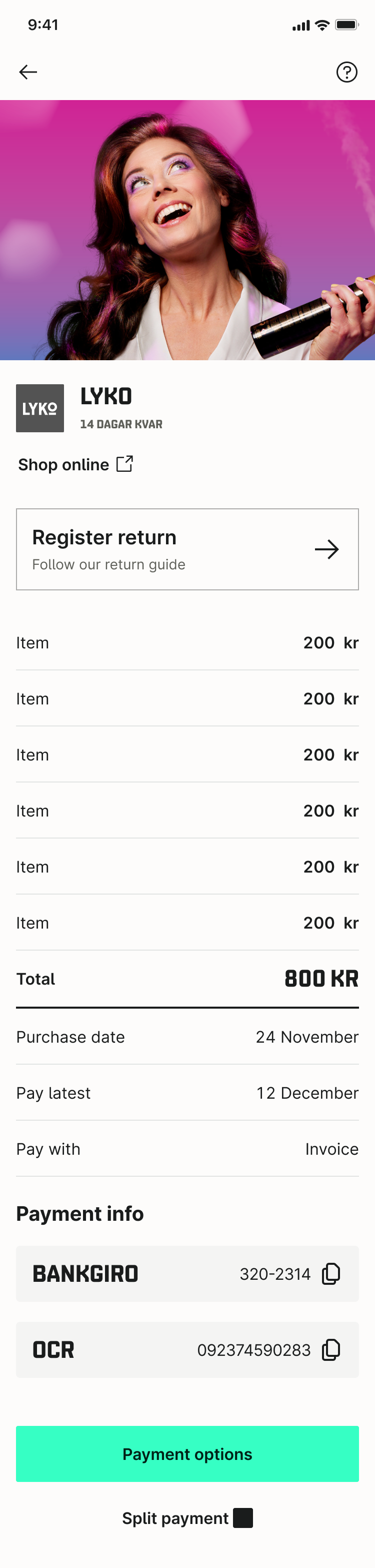
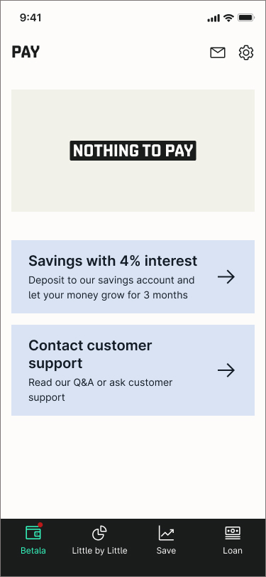
Left to right: first page of the app after login, invoice details, and zero state. Smaller cards created overview, whilst working with Qliro brand colors converyed status. A new section showing most recent paid invoice on the startpage gave a sense of control and accomplishment.
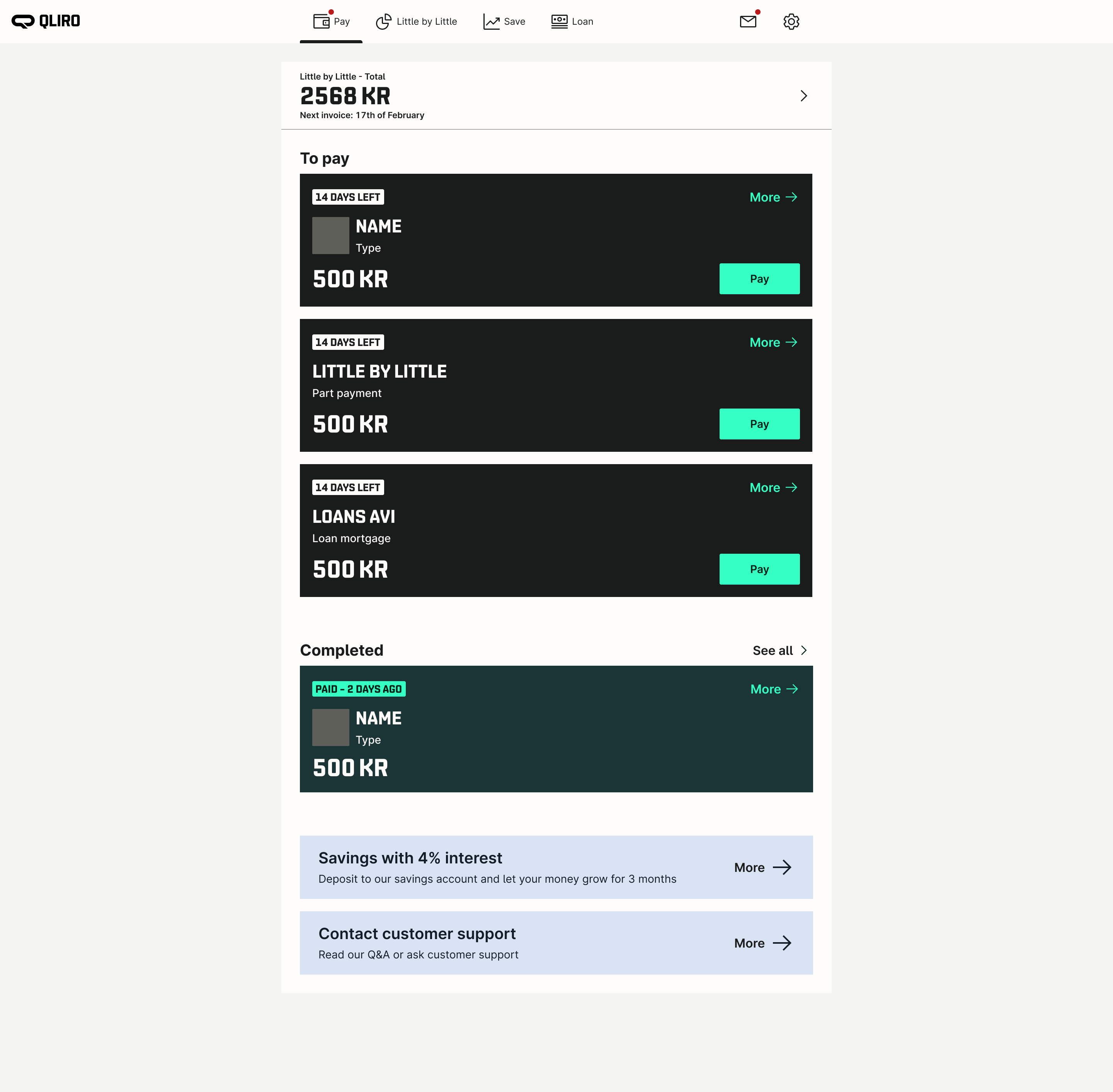
Web view of logged in state. Pretty much the same UI as in the app, which created efficient implementation and design processes.
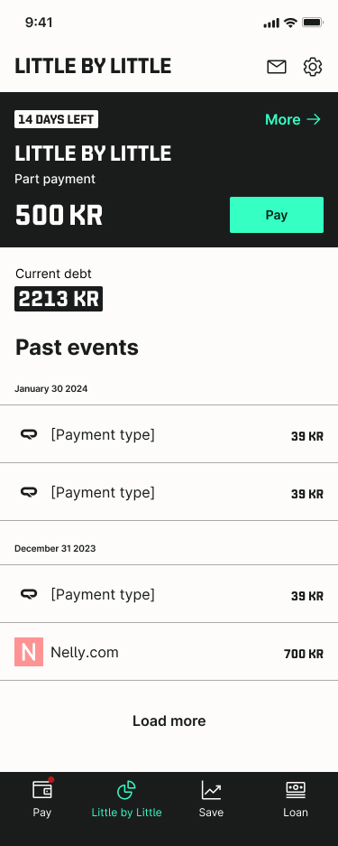
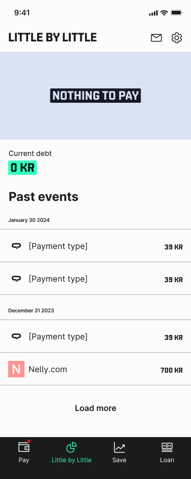
Little by little got its own menu item. This helped part payment customers find info on their payment quicker and easier. Black card in the left UI is the same as shown on the first page of the app if the user has a payment to take care of.

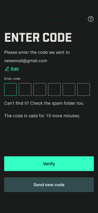
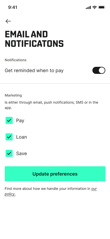
Part of the email verification desig. Same UI was reused for phone verification, but with changed copy. Efficient design and implementation.
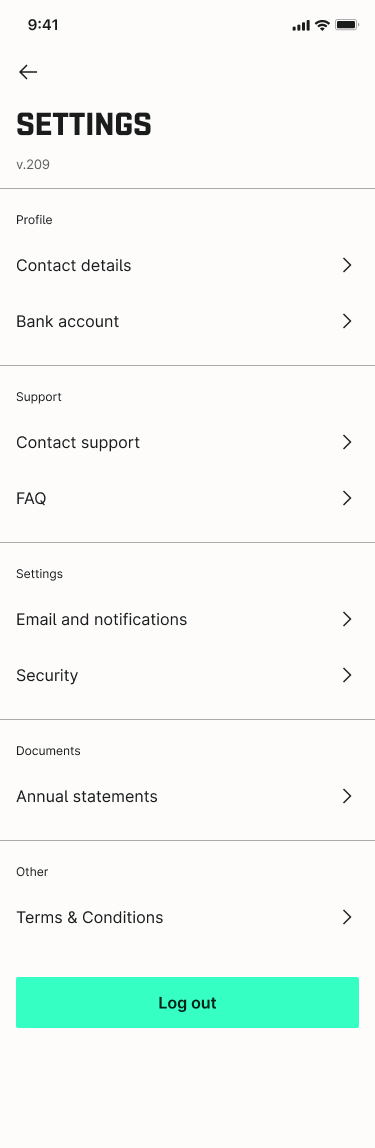
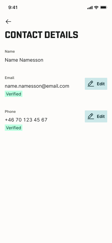
New settings page. Restructured the page and updated groupings for settings, updated copy and labels.
Andreas Grünewald
Strategic UX Designer & Design Lead
QLIRO
App & Web - Lead Designer
About the project
A core part of the Qliro offer is their logged in web and app experience through which their users can pay their invoices, handle returns, get support, create a savings account or take a loan.
Qliro needed a designer consultant to cover up for a parental leave, and design user validations flows and implement a new translation tool. At my time there I pushed for and got through a redesign of the start page overview for invoices and part payments, a design system update, minor navigation fixes and a redesign of the settings pages.
Role
Lead Designer, UX Designer
Outcome
- Redesigned app and web start page (logged in) for easier navigation, overview and control over invoices and tasks
- Updated part payment experience for easier overview and clearer expectations on actions from the user
- Updates to navigation
- Redesign of the settings pages
- Updated the design system and improved implementation speed from design to production in parallel with other ongoing work
- Validated and selected translation tools, and created key naming conventions to be used within the team
- Created and designed a user validation system through email and phone number
The Challenge
- Time; I had 4 months in the team
- Stakeholder management
- High ownership on design requiring tight collaboration with PO and CPO
- Lack of user contact points
Design Process
A small team owned the whole app & web experience, competing with giants such as Klarna. This meant having a high tempo, tight collaboration, quick decisions and to rely on the senior experiences within the team and stakeholders.
The design process for user facing features was quick, with wireframes to showcase concepts and to get approval, moving quickly to hi-fis and implementations. We relied on conventional UI patterns, familiar design concepts, and followed the laws of UX (www.lawsofux.com) to back up our interaction design decisions. User testing was done with my consultant colleagues and through a practitioner in the team.
This was applied to new start page, where we improved overview and user control over tasks, navigation changes and settings page design update.
The design system was updated in parallel to other features. That meant starting with designs and using new components in the new features. These components were implemented with the new features. This allowed me to be some steps ahead, and for developers to use implementation time for new features to also update the design system.
The validation process was based on common logic seen in many other products that verifies emails and or phone numbers. The design was made so that the same logic can be applied for email and phone, with only minor copy changes differing between them. This meant a simple implementation and a easy-to-understand user flow.
Translation tool selection and implementation was a joint task with PO, CPO, me and our tech lead. We landed on using Phrase, and for that I created a key naming convention that can be used by design and developers alike, so we can create unique keys for each text.
Solution was a drill-down key name, in the format of Page_Topic_Section_Text.Example is; Settings_Account_Email_EmailEntry.
The Designs
Left to right: first page of the app after login, invoice details, and zero state. Smaller cards created overview, whilst working with Qliro brand colors converyed status. A new section showing most recent paid invoice on the startpage gave a sense of control and accomplishment.
Web view of logged in state. Pretty much the same UI as in the app, which created efficient implementation and design processes.
Little by little got its own menu item. This helped part payment customers find info on their payment quicker and easier. Black card in the left UI is the same as shown on the first page of the app if the user has a payment to take care of.
Part of the email verification desig. Same UI was reused for phone verification, but with changed copy. Efficient design and implementation.
New settings page. Restructured the page and updated groupings for settings, updated copy and labels.